Dual Pricing Signage: What Your Sign Must Say and Where It Goes
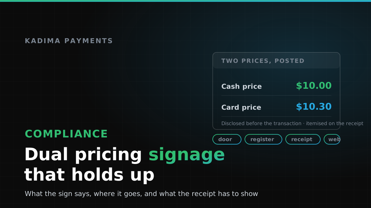
Most dual pricing programs are not undone by the pricing. The arithmetic is simple, the model is permitted in most of the country, and the terminal handles the maths without being asked twice. What gets a merchant a warning letter, a fine from the acquirer, or an awkward conversation at the counter is almost always the same thing: disclosure. The sign was missing, or vague, or behind the register where nobody reads it. The receipt showed one total and no explanation. The checkout page revealed the card price after the customer had already decided to buy.
This is the practical half of dual pricing. If you are still deciding whether the model is permitted where you trade, read is dual pricing legal first — it covers state restrictions, network caps and notification rules. If you have decided and now need to know what to print and where to put it, you are in the right place.
The sign is the compliance control
Every version of this model — surcharging, cash discounting, dual pricing — rests on one requirement: the customer has to understand the price difference before the transaction takes place. That is the standard the card networks apply and the standard an inspection tests. A program where the customer discovers the card price at the moment of payment fails it, however carefully the rest was set up.
So the sign is not marketing collateral. It is the control that proves compliance, and it has to serve three different customers: the one deciding whether to walk in, the one deciding what to buy, and the one checking the receipt afterwards. Three moments, three pieces of signage.
The four places disclosure has to appear
1. The entrance
The first sign belongs where someone sees it before committing any time to you: on the door, the window, or immediately inside. It need not be large, but it must be readable without stopping — short sentence, high contrast, at adult eye level. Its only job is to make the pricing model known before the customer is invested.
2. The point of decision
The second sign goes where the customer chooses what to buy, which for most businesses is not the register. On a menu, a line at the top or bottom of every page, not just page one. On a shelf-edge label, beside the price rather than on a poster across the aisle. In a service business, on the estimate or work order. The rule of thumb: if the customer can form a view of what they are about to pay without seeing the disclosure, the disclosure is in the wrong place.
3. The receipt
The receipt is the one merchants most often skip, and the one that leaves a paper trail. Whatever the difference is called in your program, it has to appear as a separate, named line — not folded into the total, not an unlabelled adjustment. A receipt showing a single figure gives you nothing to point to when a customer disputes the charge, and a chargeback defended with an itemised receipt goes very differently from one defended with a total.
4. Online checkout
If you sell online too, the same disclosure has to appear on the checkout page before the customer finalises payment — on the page where they choose how to pay, not buried in terms and not revealed on the confirmation screen. The cleanest implementations show both figures beside the payment-method selector, so the customer picks a price rather than discovering one.
Wording you can copy
Plain, specific and identical everywhere beats clever. Use the same phrasing on the door, the menu, the receipt and the checkout page; a customer who reads three descriptions of one policy concludes that one of them is a trick.
For a dual pricing display (both prices shown):
All items are listed with two prices: a cash price and a card price. Pay with cash and you pay the lower price. Pay with a credit card and the card price applies.
For a cash discount program (list price is the card price):
Listed prices reflect the card price. A discount is applied to the total when you pay with cash.
For a surcharge program (a fee is added to the listed price):
We add a surcharge of X% to credit card transactions, which is not greater than our cost of acceptance. We do not surcharge debit cards.
For an online checkout:
Card price $XX.XX · Cash or bank transfer price $XX.XX. The price shown updates when you choose a payment method.
Two words to keep off every sign: convenience fee. It describes a different thing entirely under the network rules, and using it to describe a card price difference is a reliable way to turn a compliant program into a non-compliant one on wording alone. If you surcharge, call it a surcharge. If you discount for cash, call it a cash discount.
Six ways a compliant program still fails its signage check
- The sign is after the decision point. Taped to the card reader, facing the staff side, or posted at the exit. The customer has already chosen; disclosure at that point is not disclosure.
- The receipt does not itemise. The difference is charged but never named on the printed or emailed receipt, which is exactly the evidence a disputed transaction needs.
- Debit gets treated like credit. If you run a surcharge program, the networks do not permit surcharges on debit or prepaid cards, which means your terminal has to tell one from the other reliably and your sign has to say so.
- The sign and the terminal disagree. The poster says one percentage, the terminal charges another after someone changed a setting. Re-read your own signs whenever pricing changes.
- Only one channel is covered. Signage at the counter, nothing at all on the website, or vice versa. Every channel that takes a card needs its own disclosure.
- Vague language. “Prices may vary by payment method” tells the customer nothing and will not read as clear disclosure to anybody reviewing the program.
Make the terminal agree with the sign
Signage is half of the job; the other half is a point-of-sale configuration that produces exactly what the sign promised. That means the two prices calculated the same way on every item, a receipt template with the difference as its own line, and card-type detection that keeps debit out of a surcharge program. Counter and restaurant setups are covered on our retail POS and hospitality payments pages; if you are running the same pricing through a web checkout, ecommerce payments covers the online side, and your developers will find the charge and receipt fields in the developer documentation.
Worth testing before you go live: run one cash sale, one credit sale and one debit sale, then read all three receipts as a customer would. Most signage problems are visible in ninety seconds.
Rolling it out
The order that works: inventory every place a price is shown — door, shelf labels, menus, estimates, the register, the receipt template, the website. Write one sentence and use it everywhere. Print and place it, checking sight lines from where customers actually stand rather than from behind the counter. Brief the staff with a single line they can say out loud — “prices are lower for cash, the card price is on the label” — because the person at the register is the disclosure customers actually hear. Then photograph each placement and keep the photos with your merchant file; if the program is ever questioned, dated photographs are the fastest answer available.
One sequencing point specific to surcharging: Visa and Mastercard each require at least 30 days’ advance written notice to the network and to your acquiring bank before you start applying surcharges. That notice is not signage, but it belongs on the same rollout plan, and starting before it is filed is a self-inflicted problem. Cash discount and dual pricing structures do not carry the same notification requirement.
Your signage checklist
- Sign at the entrance, readable without stopping.
- Disclosure wherever the customer chooses — menu pages, shelf edges, estimates, quotes.
- The difference as a named, separate line on every receipt, printed and emailed.
- Checkout-page disclosure before payment is finalised, not on the confirmation screen.
- Identical wording in every location, with no reference to a “convenience fee”.
- Terminal and receipt tested with a cash, a credit and a debit sale.
- Debit excluded if you surcharge; percentage on the sign matching the terminal.
- Thirty days’ written notice filed if you surcharge.
- Dated photographs of each placement kept on file.
- State rules confirmed for every state you trade in, and re-confirmed when you expand.
Before you print anything
This is a practical guide, not legal advice. State rules on surcharging and cash discounting differ from one another and change, and card-network requirements are updated periodically — confirm the current position for every state you operate in, and with your acquirer, before you launch. Our guide to dual pricing legality sets out the state and network landscape, and should you use dual pricing covers whether the model suits your business and how customers tend to react to it in the first month.
Kadima configures dual pricing on the terminal and the online checkout, supplies signage that matches what the hardware actually does, and tells you plainly when your state or your vertical makes a cash-discount structure the better route. See if you qualify in about a minute, or call (888) 292-8555 or email [email protected] and we will review your setup before you print a single sign.
Signage that matches what your terminal charges
We set up dual pricing end to end — terminal configuration, receipt template and the signage to go with it — so the disclosure and the charge always say the same thing.